2026 is the year to embrace depth, drama and a little bit of design risk in a space. As interior designers, we are over seeing the plain, white boxes builders call homes. We are inviting people to bring back the character into their homes, and this article will give you the perfect insight into when and how you should incorporate them into your space.
Before we dive into the paint colors, I want to talk about LRV. LRV stands for Light Reflectance Value. This tells you how light or dark a color actually is on a 0 to 100 scale. The lower the number, the more light is absorbed. This translates to the color reading darker. The higher the number, the less light is absorbed, making the color lighter.
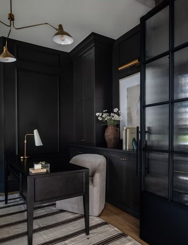
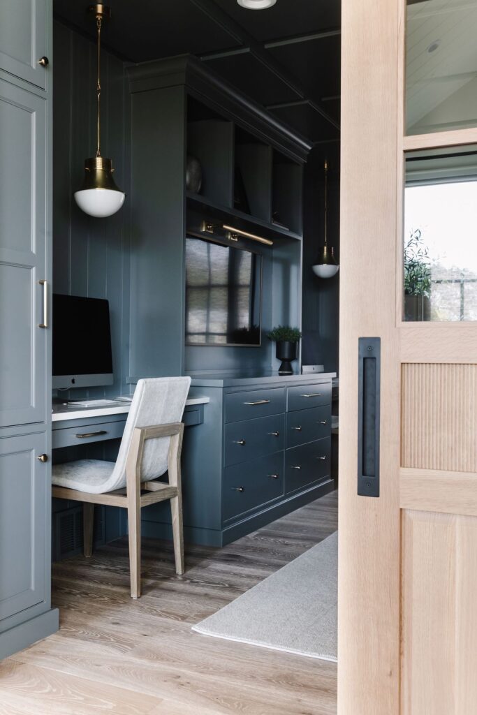
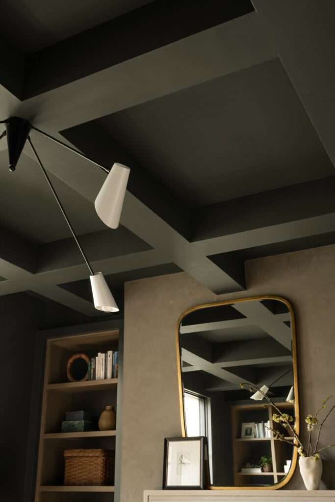
Iron Ore
Iron Ore (space above by Hackett House Studio) has a LRV of 6. This paint color is a deep, soft near-black charcoal that doesn’t read as a true black. In different lighting, you may notice subtle hints of green and gray, giving it depth without feeling flat. I most often use this color on kitchen island and in home offices, where it adds contrast and intention. If you’re looking for a sophisticated, grounded color that feels bold yet livable, this is one I would confidently include in your space.
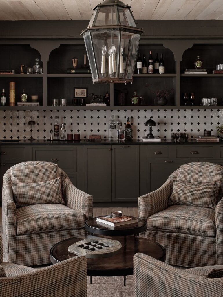
Roycroft Bronze Green
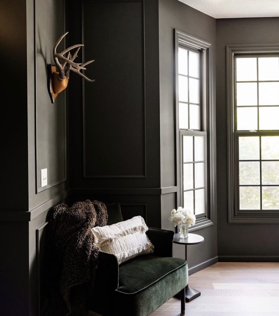
Roycroft Bronze Green (space above designed by Jordan Willaby) has a LRV of 5. This paint color is a rich, moody green with earthy undertones that can have a subtle bronze warmth in sunshine. Roycroft Bronze Green is often chosen when someone wants a classic, heritage-inspired color that feels rich and grounded without leaning trendy. I love using this shade primarily in sitting rooms, kitchens, and home offices.
Labradorite
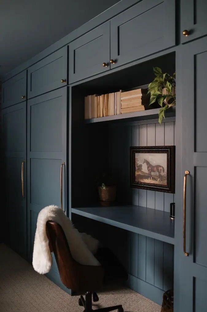
Labradorite (space above designed by Hunter Premo) has a LRV of 8. This paint color is a deep, moody gray-blue that sits between classic blue and slate gray, giving it a calm yet sophisticated presence. Its undertones lean cool, with subtle blue-gray character. Labradorite is often selected when someone wants a moody blue that feels refined rather than bold or nautical. I gravitate using this color in home offices, kitchens, and sitting rooms.
Greenblack
Greenblack (space above designed by Studio McGee) has a LRV of 4. This paint color is a near-black shade that really lives in the gray-to-green spectrum. It reads almost black in low light but reveals a subtle, deep green undertone in brighter lighting. Greenblack is often chosen when someone wants drama of black but with a subtle twist of personality. I often choose this tone for lower cabinetry or home offices.
Storm Warning
Storm Warning (space above designed by Remedy Design Firm) has a LRV of 11. Although this color has a higher LRV than the previous paint colors, it still feels deep and dramatic. It may feel a touch more livable in larger spaces or rooms with moderate natural light. Storm Warming is a deep, smokey blue-gray with undertones being cool and slightly steel-toned. In natural light, you’ll notice more of its blue character, while in lower light, it settles into a moodier charcoal-gray feel. I often gravitate toward this shade in home offices, bedrooms, and basements.
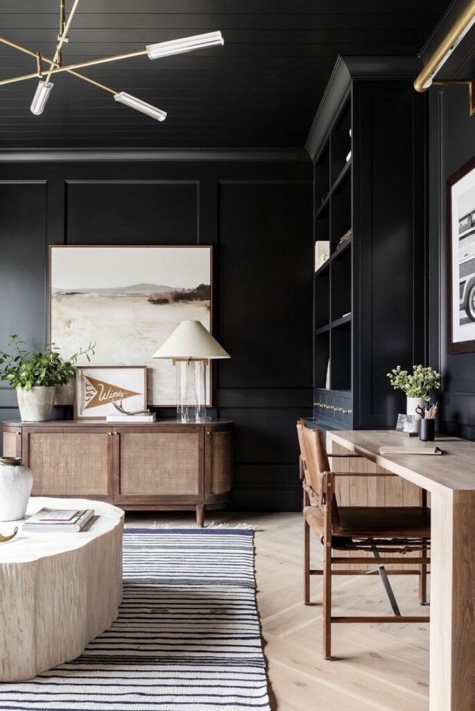
Urbane Bronze
Urbane Bronze (space above designed by April Tomlin Interiors) has been the talk of the town in 2025. This paint color showed up the most on my social media feed and was used in many spaces designed by interior designers. This paint color lands on the LRV scale of 8. Urbane Bronze is a deep, warm charcoal with rich brown undertones that give it an earthy, grounded look. In brighter light, its warmth becomes more apparent, while in lower light, it reads a nice, dark neutral. I often incorporate this color in powder bathrooms and home offices.
Porpoise
Porpoise (space above designed by Remedy Design Firm) has a LRV 13. This paint color is a rich, warm gray with soft brown undertones. It doesn’t lean cool and instead, it has an earthy greige base. In brighter light, the warmth becomes more noticeable. In lower light, it deepens into a taupe-gray. This paint color is noticeably lighter than colors like Iron Ore or Greenblack. This paint color looks nice in reading rooms and home offices.
Cyberspace
Cyberspace (space above designed by Stonebrook Home) has a LRV of 6. This paint color is a deep blue-gray with cool undertones. It doesn’t lean overly navy and instead has a smoky base. In brighter light, the blue undertone becomes more noticeable. In lower light, it reads to a soft charcoal. This paint color is similar in depth to Iron Ore but carries more blue. Someone might use Cyberspace when black feels too stark and navy feels too traditional. I often incorporate this paint color in home offices, kitchens, and powder bathrooms.
Rock Bottom
Rock Bottom (space above designed by Studio McGee) has a LRV of 7. This paint color is a deep charcoal with subtle green undertones. It reads with a softened, earthy base. In brighter light, the green undertone becomes apparent. In lower light, the color settles into a rich, dark gray. This paint color is similar in depth to Iron Ore but carries a touch more warmth. Someone might use Rock Bottom when they want the drama of a dark neutral without going fully black. I often incorporate this paint color in home offices and kitchens.
Moody paint colors have a way of transforming a space instantly. Whether you’re drawn to deep charcoals, earthy greens, or smoky blue grays, each of these shades offers depth and character in its own way. The key is choosing the tone that aligns with your home’s natural light and overall aesthetic. When selected thoughtfully, darker colors do not feel heavy. They feel refined, layered, and timeless.
February 23, 2026
9 Dark and Moody Paint Colors by Sherwin Williams for Interiors
February 23, 2026

Leave a Reply